
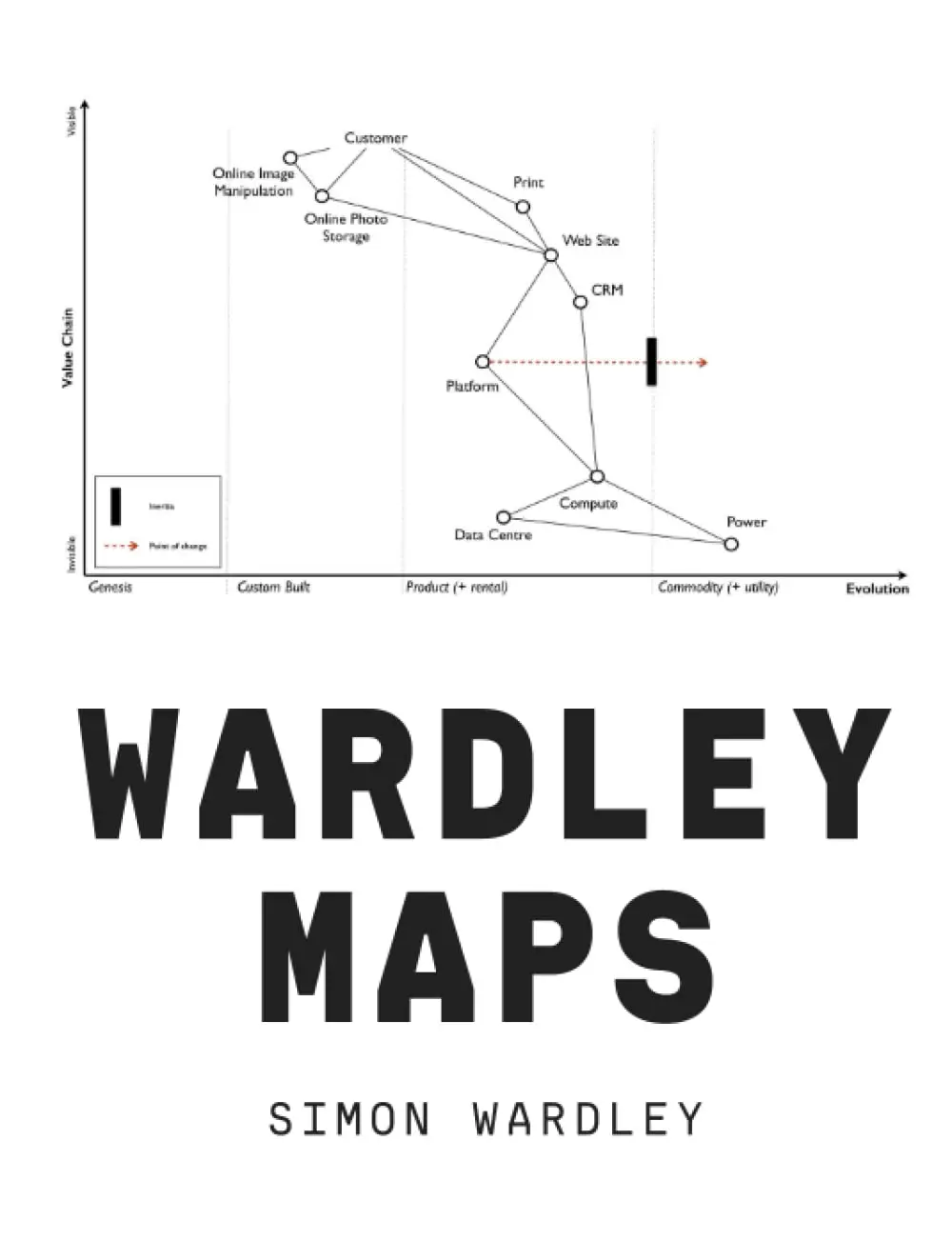
Wardley Maps is Simon Wardley’s book on the strategy mapping technique he developed during his time as CEO of a technology company. The central idea is simple but powerful: most strategic tools (like SWOT analyses or Porter’s Five Forces) don’t give you a sense of movement. They describe where things are but not where they’re going. Wardley’s maps add a dimension of evolution: every component of a business (technology, practice, data, activity) moves over time from novel and poorly understood to standard and commodity-like, and the strategic implications change at each stage.
A Wardley Map has two axes. The vertical axis shows the value chain: what the user needs at the top, and the components required to deliver it below. The horizontal axis shows evolution: from genesis (new and uncertain) on the left, through custom-built and product stages, to commodity and utility on the right. By mapping your business on these axes, you can see which components are evolving toward commodity (where competing on execution and cost matters) and which are still in the early stages (where investing in innovation gives you an advantage).
The technique also helps you see competitive threats. When a component evolves from product to commodity, the companies that built their business on that component lose their advantage. Cloud computing, for example, turned server infrastructure from a custom-built capability into a commodity utility, which disrupted companies that sold servers while enabling companies that built applications on top of commodity infrastructure.
For founders, Wardley Maps provide a way to think about strategic positioning that goes beyond “find a market and build a product.” By mapping the evolution of every component in your value chain, you can see where the industry is heading, where new opportunities will emerge, and where your current advantages will erode. The technique is particularly useful for technology companies where the underlying infrastructure is evolving rapidly.
The book originated as a freely available online text (still accessible at learnwardleymapping.com), and the writing reflects that origin: it is conversational, somewhat repetitive, and organized more like a series of blog posts than a traditional book. The diagrams are the star of the show, and readers who are visual thinkers will get more from the mapping technique than from the prose. The technique has a learning curve, but founders who invest the time to learn it report that it changes how they think about strategy permanently.
