
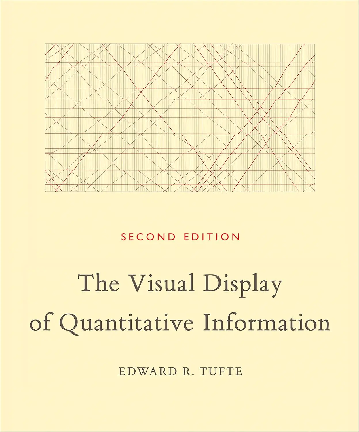
The Visual Display of Quantitative Information is Edward Tufte’s foundational text on how to present data visually. Published in 1983, it established the vocabulary and principles that the field of data visualization still operates on. Tufte self-published the book after traditional publishers wanted to reduce its visual quality, and the result is one of the most beautiful non-fiction books ever printed, with hundreds of carefully reproduced examples from cartography, statistics, and graphic design.
Tufte’s central principles are simple. Maximize the “data-ink ratio,” meaning every drop of ink on the page should represent actual data rather than decoration. Avoid “chartjunk,” the unnecessary gridlines, 3D effects, and graphical noise that clutter most business charts. Show data honestly by choosing scales, baselines, and encodings that don’t distort what the numbers actually say. And above all, respect the viewer’s intelligence: well-designed graphics can communicate complex information quickly and accurately, which is exactly what data is for.
The historical examples are one of the book’s great pleasures. Tufte reproduces Charles Minard’s famous 1869 map of Napoleon’s march on Moscow, which he calls the best statistical graphic ever drawn. He also includes John Snow’s cholera map of London, early weather charts, and dozens of other examples that show how visual data display has evolved over centuries.
For founders who present data regularly, Tufte’s principles are worth internalizing even if you never design a chart yourself. Understanding what makes a good visualization helps you evaluate the charts your team produces and avoid the common traps of misleading or cluttered data presentation. The data-ink ratio concept alone will change how you look at every dashboard and slide deck.
The book is more of an art object than a typical business book. Tufte printed it on high-quality paper with careful attention to typography and layout. It reads more like a series of illustrated essays than a how-to guide. Readers looking for practical step-by-step instructions should start with Storytelling with Data and come to Tufte for the underlying theory and aesthetic education.
